Newsletter
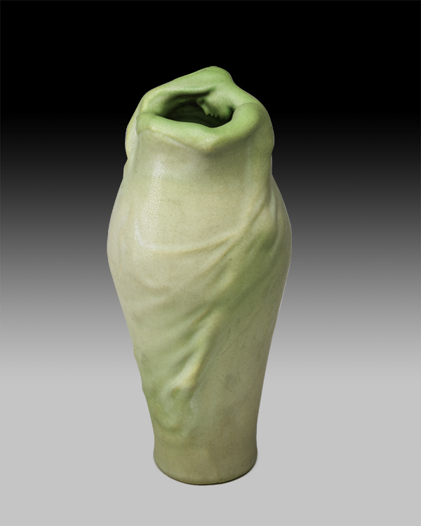
Van Briggle, Lorelei, 1902
10 ¼" x 4 ½"
Two-color glaze
Colorado Springs, CO,
Marked: AA VAN BRIGGLE 17/1902/III
"Lorelei" is a Germanic name meaning "luring rock". It is also the name of a rock headland on the eastern bank of the Rhine River which soars nearly 400 feet above the waterline. Legends say that a maiden named Lorelei was a beautiful seductress whose haunting voice led sailors to these hazardous rocks, causing them to be shipwrecked.
Auctioneer David Rago, foremost expert in American Arts and Crafts pottery and appraiser on the Antique Roadshow, states: "This vase, which bears a signature in Van Briggle's hand, is the only two-color version from 1902, essentially the first multi-color Lorelei known, and one of only a few of his iconic form of such early vintage. The modeling is excellent, as is the condition. I would think that, if one only wanted an exceptional single example of Van Briggle's work, this may as well be it."
Rago was indeed correct about the desirability and rarity of this vase, but understated its potential value to collectors, which soared to $275,000 well above the estimate of $50,000 to $75,000, surely an auction record for a Van Briggle vase! In a recent article of the Arts and Crafts Collector's Newsletter, Bruce Johnson describes the Lorelei vase as "by far the most popular vase ever designed and produced at the Van Briggle Pottery, and possibly the most famous piece of American art pottery ever produced".
The Two Red Roses Foundation is proud to add this example to its outstanding pottery collection.
Beauty In Common Things: American Arts and Crafts Pottery from the Two Red Roses Foundation, by noted author Martin Eidelberg, includes a section on the Van Briggle pottery, its history, and many biographical notes on Van Briggle himself. Eidelberg also catalogs and describes some of the Van Briggle vases in the TRRF collection.
Despite the brevity of his career, Artus Van Briggle (1869-1904) was one of the few independent American ceramists at the turn of the century who enjoyed an international reputation. Tuberculosis had caused him to forego his position as a decorator at the Rookwood Pottery in Cincinnati and move to the healthier climate of the Rocky Mountains. Once in Colorado, he established a pottery and his art flourished even more brilliantly than in Ohio. However, his illness all too abruptly brought an end to his career, just as he reached the pinnacle of success.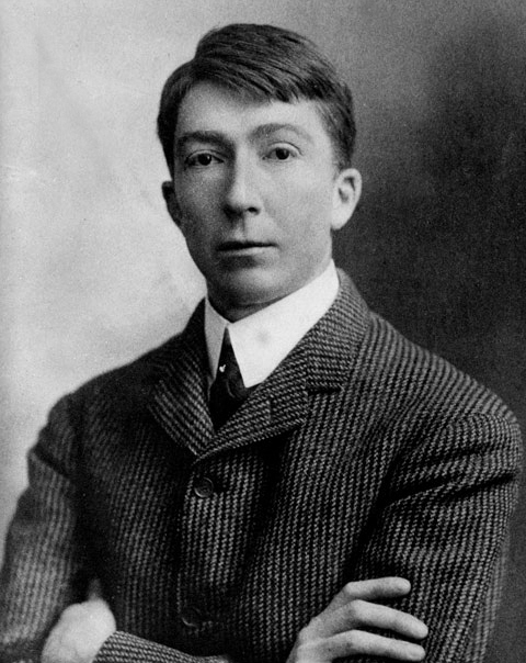
Artus Van Briggle
c. 1900
Van Briggle, whose family claimed descent from the great sixteenth-century painter Pieter Bruegel, was born in Felicity, Ohio. His early aspiration to become a painter drew him to Cincinnati to study with Frank Duveneck at that city's Art Academy. He worked briefly as a decorator at Avon Pottery in 1886, but by the following year was at the Rookwood Pottery, whose reputation as this country's leading art pottery was already established. There he conformed to the company's style of naturalistically rendered plants, birds, and insects--executed in the dark, "Rembrandtesque" tones which characterized the firm's Standard line. All the while, his aspirations as a painter remained undiminished, and the acceptance of his portrait of his grandmother at the Chicago World's Fair of 1893 was encouraging.
The following year the Rookwood Pottery awarded him a stipend to study in Paris. There he studied painting, not the decorative arts. He attended classes at the Académie Julian, a favorite haunt of American art students. Van Briggle's account of this trip, reported by several American critics, does not acknowledge the attention he must have paid to modern French decorative arts. Yet this clearly happened since his later art reflected quite specific strains of Symbolism and Art Nouveau that were beginning to emerge in Paris. Van Briggle described only his study of Chinese "dead" glazes in French museums, but he could not have been oblivious of the success enjoyed by Edmond Lachenal's new mat glazes, introduced in just those same years.
When Van Briggle returned to Cincinnati and the Rookwood Pottery in 1896, he resumed painting in Rookwood's naturalistic style of underglaze decoration, but he also initiated experiments with mat glazes. Albert Valentien, the head of the decorating department, confirmed that Van Briggle introduced mat glazing to Rookwood and, indeed, he was responsible for the very first objects with such glazes executed there. An important example of Van Briggle's work at this time is an 1898 vase with a Symbolist woman draped around and merging into the form of the vessel, an early version of a design known today as The Lorelei. This work announced his mature style, one in which the decoration is modeled rather than painted, and is integral with the form of the vessel. Remarking upon an example of this model shown at the 1899 exhibition of the National Arts Club in New York City, a reviewer singled out "one vase, which at first glance seemed a piece of melted half opaque grey glass, resolved itself into a quaintly modelled mourning nymph." The Rookwood Pottery included this work as well as some of his painted Standard wares in its exhibit at the Paris World’s Fair of 1900.
In March 1899, however, Van Briggle moved west in the hope that the drier weather of Colorado would improve his condition. Experimenting with local clays soon after his arrival in Colorado Springs, he worked with Professor William H. Strieby at Colorado College. Some of Van Briggle's work was sent back to Mrs. Storer, the founder of the Rookwood Pottery, thus suggesting that he did not leave on as badterms as modern writers often imply. With her encouragement—and possibly financial support—Van Briggle set up his own workshop in a small cottage. Gradually, a substantial number of sculpted prototypes were produced and a new pottery operation was underway. In August 1901, the Van Briggle Pottery Company opened and soon thereafter a celebratory exhibit fêted the first three hundred pieces that had been fired.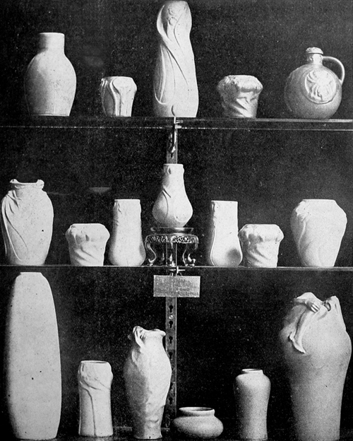
Display of Van Briggle pottery (from Art Interchange, 1903).
Most of Van Briggle's new designs were floral in subject and only a few featured human figures, although these have since become the most celebrated of his designs.
At the time it was often emphasized that he portrayed Colorado wild flowers, but many of the motifs—such as mistletoe and peacock feathers—are more international than regional in character. Equally important is the way that they are conventionalized. Many are charged with a vibrant whiplash curve in the Art Nouveau manner, although some are rigidly vertical. Van Briggle’s sense of conventionalized design, especially when compared with American decorative arts as a whole, was in the forefront. Yet the terms "Symbolist" and "Art Nouveau" were rarely attached to his designs. Edwin Atlee Barber, for example, wrote that, "The details of the human figure are often suggestive, and only partially revealed, as though emerging from water, the effect being most artistic. In some of the simpler pieces the decoration is a conventionalized treatment of geometrical and floral devices."
One of Van Briggle's contributions was the development of a wide spectrum of mat glazes. Although his first attempts are marked by a very dry surface, a softer, velvety surface was soon achieved. To promote Van Briggle pottery as a regional art, the glaze colors were characterized as expressions of the Western clime. Probably mirroring the company’s own publicity, a Colorado Springs newspaper described them as “akin to the deep blues and turquoises of the skies, to the greens of summer and to the wonderful rosy and tawny tones of the plains in winter." Yet, it was also recognized that these colors corresponded to general developments in ceramics. They were not compared as they should have been to Lachenal's glazes, but were described in American terms: "The glaze is mat, similar to the Grueby effect, but showing rather the coloring of the Rookwood Iris ware." Indeed, Grueby's mat glazes had been the first to reach market and seize the public’s attention; as a result, he was always credited with introducing mat glazes to American pottery. Yet Van Briggle had embarked concurrently on experiments with mat glazes and, moreover, his palette was brighter and more extensive than that employed by Grueby.
In many ways, Van Briggle's pottery fulfilled most principles of the Arts and Crafts movement. It was a small establishment, with the artist and his wife, Anne Gregory, designing and modeling the prototypes and creating the glazes (fig. 10.1). As Irene Sargent described it, he was the ideal craftsman: "He is able equally to conceive and to execute: to produce form, calculate color, employ technical process and fashion by manual labor." The one major divergence was that while he sculpted the prototypes, a mold was then made and vases were produced by casting in small series. Van Briggle was evidently aware of the degree to which this might offend Arts and Crafts purists and vigorously defended his position. As reported by Sargent, "…the repetition of a fine, slowly-developed model being regarded by Mr. Van Briggle as far preferable to the execution in each case of a new idea which often entails careless and inartistic work." To overcome possible charges of soulless, mechanical repetition, Van Briggle consistently emphasized that the coloring of each vase was different. Indeed, often one glaze was applied over another and then manipulated so as to create unique, artistic effects.
Serial production was of crucial importance because it helped make the pottery commercially viable. At first there were only two assistants — a professional thrower and a shop boy. Then, as production began in earnest, workers were hired to grind and mix the clays and glazes, to pour and trim the casts, and to supervise the firings. Nonetheless, it seems to have been a small community of workers.
Through articles in various handicraft magazines, Van Briggle's work was quickly publicized nationally. A group of vases he sent to the Paris Salon of 1903, some of which were purchased by the French government, afforded him international exposure. His display at the St. Louis World's Fair of 1904 was the highpoint of his career: he won a gold medal and his wife was awarded a bronze medal. However, this triumph came too late. He had died on July 4th, and his stand was then left draped in black for the remainder of the exposition.
The Van Briggle pottery continued to function after his death, headed now by his wife. Old models continued in production and new ones were introduced. The manufacture of tiles, something that Artus Van Briggle had initiated, proved successful and required a larger plant. Construction on a new and quite beautiful, tiled building, somewhat farther out of town, began in 1907, with full pottery production underway by the autumn of 1908. The company remained in operational at this site for another half century, and then moved to another property. The Van Briggle Pottery is still in operation today. The firm has the distinction of being the only Arts and Crafts pottery to have remained constantly in production to modern times. However, early on models were debased and the glazes became garishly bright. The artistry of Van Briggle's work was soon lost sight of.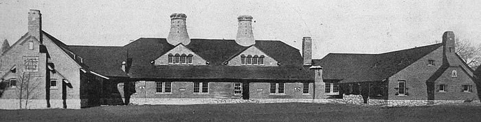
View of the Van Briggle Memorial factory, 1907 (from Glass and Pottery World, 1908)
The next five vases are in the pottery collection of the Two Red Roses Foundation and are cataloged and described by Dr. Eidelberg:
Vase with a design of conventionalized geese (model no. 5), executed 1902
Designed by Artus Van Briggle, c. 1900
Glazed stoneware; height 8 in.
Marks: on underside, incised factory cipher of conjoined "AA" within a square; incised "VAN BRIGGLE/ 1902/ III;" impressed model no. "5"
This strong but humorous design of geese is very graphic in its conception, and is an outstanding example of Van Briggle forcefully following the Art Nouveau style. The dry quality of the mat glaze on some of the geese heads and the unusual curdling of the glaze used for the background are quite distinctive and found in only the very first years of production.
Vase with a design of conventionalized poppies (model no. 2), executed 1902
Designed by Artus Van Briggle, c. 1900
Glazed stoneware; height 8 in.
Marks: on underside, incised factory cipher of conjoined "AA" within a square; incised "VAN BRIGGLE/ 1902/ III;" impressed model no. "2," impressed "D"
While Van Briggle's publicity emphasized how such flowers were native to the Western prairie, in truth, poppies were endemic in European and American decorative arts at the turn of the century. A comparison between this vase and ones by Matthew Daly and Albert Valentien, the artist’s former colleagues at Rookwood, reveals very different approaches. Daly's is modeled in low relief and Valentien's is painted in bright mat glaze, aspects which they enjoy in common with Van Briggle's, but whereas the two Rookwood decorators' renderings are naturalistic, Van Briggle's is conventionalized. The botanical details of the plant have been suppressed, the natural curvature of poppy stems has been exploited to create a more rhythmical composition, and the flowers have been cleverly arranged to fit the slope of the shoulder of the vase. There is an organic union of the vessel and its decoration.
Vase with a design of conventionalized iris (model no. 12B), executed 1903
Designed by Artus van Briggle, c. 1900
Glazed stoneware; height 15 in.
Marks: on underside, incised factory cipher of conjoined “AA” within a square; incised “VAN BRIGGLE/ 1903/ III;” impressed model number “12B”
Commenting on Van Briggle’s process of design, Irene Sargent wrote: “This potter, judged by his creations, would seem to follow a method of design which consists in making repeated drawings of a single object, without reference to the original after the first sketch is made. By this means an object is ‘simplified;’ some one feature gaining to the partial obliteration, or the exclusion of other properties.” Sargent, who was in Syracuse, apparently did not meet Van Briggle, and whether her surmise that he drew on paper is correct cannot be affirmed since all such documentation was destroyed in the flood which struck the plant in 1935. Nonetheless, her description of his design process seems fitting and corresponds, of course, to the basic tenets of conventionalization.
Handled vase (model no. 221) with mounting of conventionalized mistletoe, executed 1904
Vase designed by Artus van Briggle, c. 1903; mounting executed by Yosakichi Asano, 1904
Glazed stoneware, copper alloy; height 11 in.
Marks: on underside, incised factory cipher of conjoined “AA” within a square; incised “VAN BRIGGLE/ 1904/ III;” impressed model number “221”
By 1903, the Japanese metal worker Yosakichi Asano was at the Van Briggle factory in Colorado Springs. He had come to the United States a decade earlier, arriving in early 1894 in the company of the Rookwood decorator Kitaro Shirayamadani, who was returning from a brief trip to his native Japan. Asano was hired by Rookwood to establish a metalwork department but that venture proved unsuccessful; only soft metal mounts were made and his department was terminated in 1897. Asano then collaborated with Mrs. Storer, who had become interested in metalwork, and accompanied her to Europe from 1897 to 1901. After a trip to Japan, he returned to Cincinnati in 1902 and then went on to work for Van Briggle.
Van Briggle had the idea of creating metal mountings for his vases, some embellished with semi-precious stones. Although generally referred to as “bronze” mounts, they appear to be patinated copper. The project may have begun in 1903 but, as this and the following example show, the collaboration continued into 1904. These spectacular vases may well have been made in preparation for his display at the St. Louis World’s Fair, since some were shown there. Van Briggle himself seems to have designed the mountings as they accord closely with his personal style. Elaborate Art Nouveau designs, such as this one of mistletoe, were inevitably placed on relatively plain, monochromatic vessel. Conversely, simple metal bases, intentionally reminiscent of the wooden stands used to display Oriental vases, were used for Van Briggle’s richly sculpted vases, as seen on the following example.
Vase with a design of conventionalized peacock feathers, mounted on a base, executed 1904
Vase designed by Artus van Briggle, c. 1903; mounting executed by Yosakichi Asano, c. 1903-04
Glazed stoneware, copper alloy; height 18 in.
Marks: on underside, incised factory cipher of conjoined “AA” within a square; incised “VAN BRIGGLE/ 1904” partially destroyed by later drilled hole; impressed “A;” impressed model number “229;” remnants of an octagonal paper label with printed red border.

Pottery enthusiasts have turned to the Journal of the American Art Pottery Association since 1983 for information on Arts and Crafts pottery. Its readers are kept up to date with informative articles on collecting, buying, and selling art pottery. Published four times annually, each issue contains dramatic, full-color photographs of pottery, pottery marks, and historically significant pottery artifacts.
A very special thanks to the AAPA Journal’s long time Editor, Managing Director and past President, Linda Carrigan and former Journal Editor, Allan Wunsch who were instrumental in assembling and donating more than 70 back issues of the Journal that had been missing from the Foundation’s collection. The Foundation would also like to thank Arnie Small, the AAPA’s Board of Directors President. A fixture at the annual Grove Park Arts and Crafts Conference, he has been a friend of the TRRF since its inception, sharing his knowledge and experience freely.
For more information on AAPA, click here
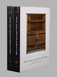
The Two Red Roses Foundation's furniture catalog So Various Are The Forms It Assumes, Arts and Crafts Furniture From The Collection of the Two Red Roses Foundation is now available for sale. This is the second in a series of six catalogs devoted to the TRRF's collection of Arts and Crafts objects. Nearly four years in the making this furniture catalog is a combined effort of noted author David Cathers, generally regarded as the foremost authority on Gustav Stickley and Mission furniture in the U.S., Arts and Crafts scholar Susan Montgomery, Alex Vertikoff, renowned photographer whose images of Arts and Crafts homes and interiors have appeared in books and magazines dedicated to the period, and Marquand Books a recognized leader in the production of museum art manuscripts and catalogs. The book retails for $60 and is available exclusively from eBay and on our website.
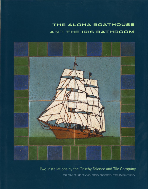
For information on other publications by TRRF, including Arts and Crafts Metalwork from the Collection of the Two Red Roses Foundation, by David Cathers and Jonathan Clancy, and The Aloha Boathouse and Iris Bathroom, by Susan Montgomery, please visit our Book Store. You may also browse through the selection of used Arts and Crafts books by clicking here.
All the books offered through our bookstore are available for purchase on eBay for those who prefer to use this platform. In addition, on eBay, we sell magazines and auction catalogs not available on our webpage.
We do not process credit card payments. You may use Paypal (who will process your credit card payment even without a Paypal account), or simply mail a check to our address. Once received we will ship your purchase promptly.